Gali Chocolate - Packaging & Brand Identity
Gali Swiss Chocolate - Brand Identity & Packaging
Gali is a Swiss chocolate brand concept built around craftsmanship, simplicity, and ingredient integrity. The project explores how a contemporary chocolate brand can feel both rooted in tradition and relevant to a modern, design-conscious audience.
The Idea
The brand is positioned at the intersection of heritage and a more intimate, food-focused perspective. Inspired by a long tradition of Swiss chocolatiers, the identity emphasizes the making of chocolate—its ingredients, process, and sensory richness—rather than relying on luxury clichés.
The goal was to create something that feels authentic, tactile, and deeply connected to how chocolate is actually experienced.
The Idea
The brand is positioned at the intersection of heritage and a more intimate, food-focused perspective. Inspired by a long tradition of Swiss chocolatiers, the identity emphasizes the making of chocolate—its ingredients, process, and sensory richness—rather than relying on luxury clichés.
The goal was to create something that feels authentic, tactile, and deeply connected to how chocolate is actually experienced.
Visual Language
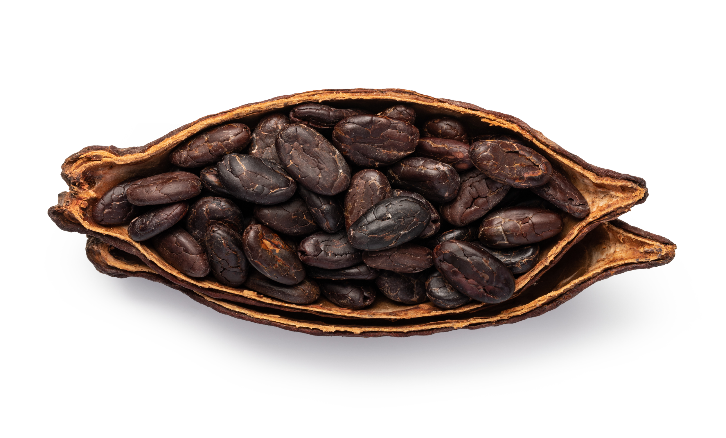
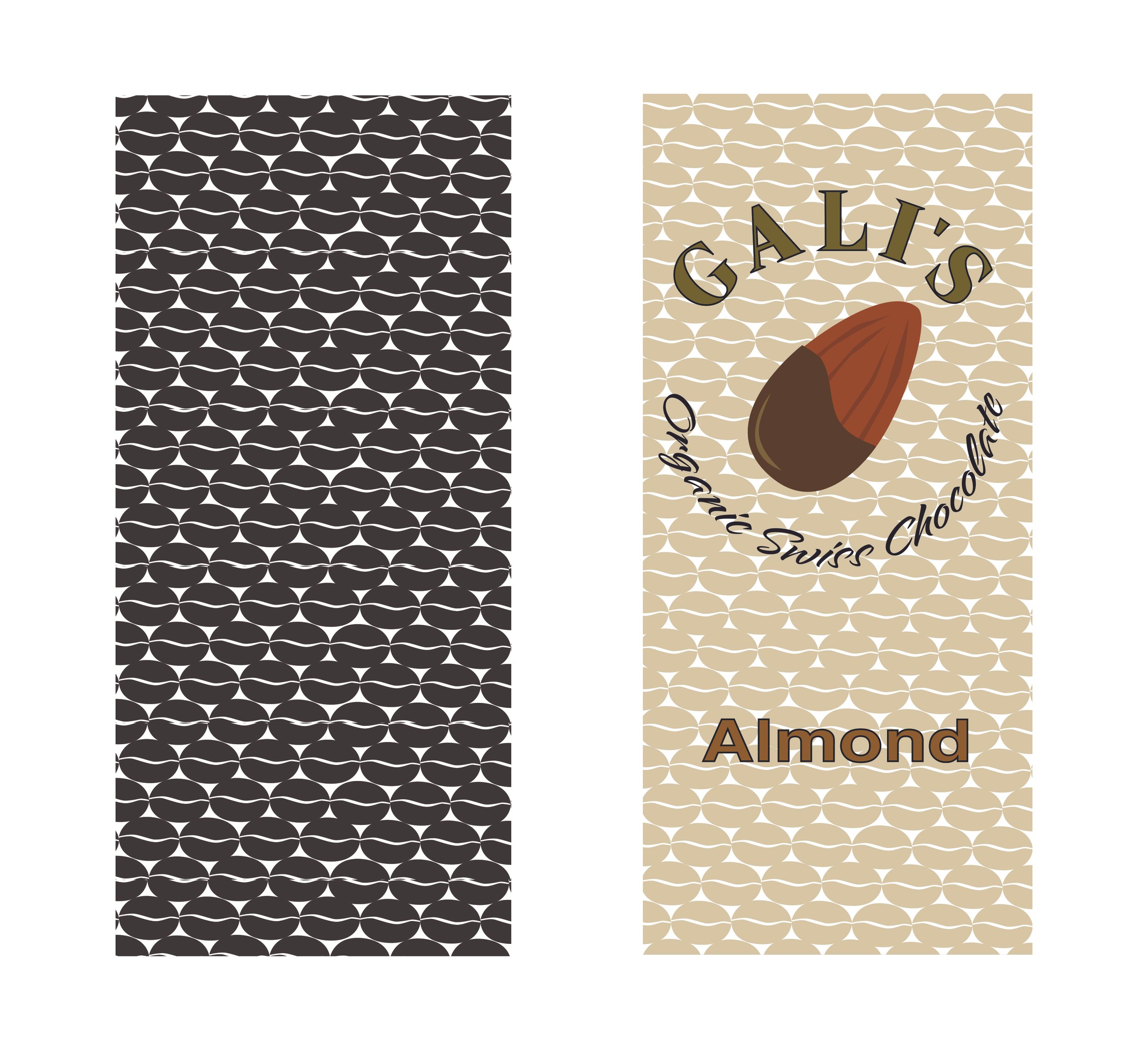
The visual system is built from cocoa-derived forms. A repeating cocoa bean pattern creates texture and rhythm across the brand, while a cross-section of the cocoa pod becomes a key graphic element—used to anchor the broader packaging system.
These elements establish a language that is both distinctive and rooted in the product itself.
Below: Early exploration of visual language and typography
Brand Identity
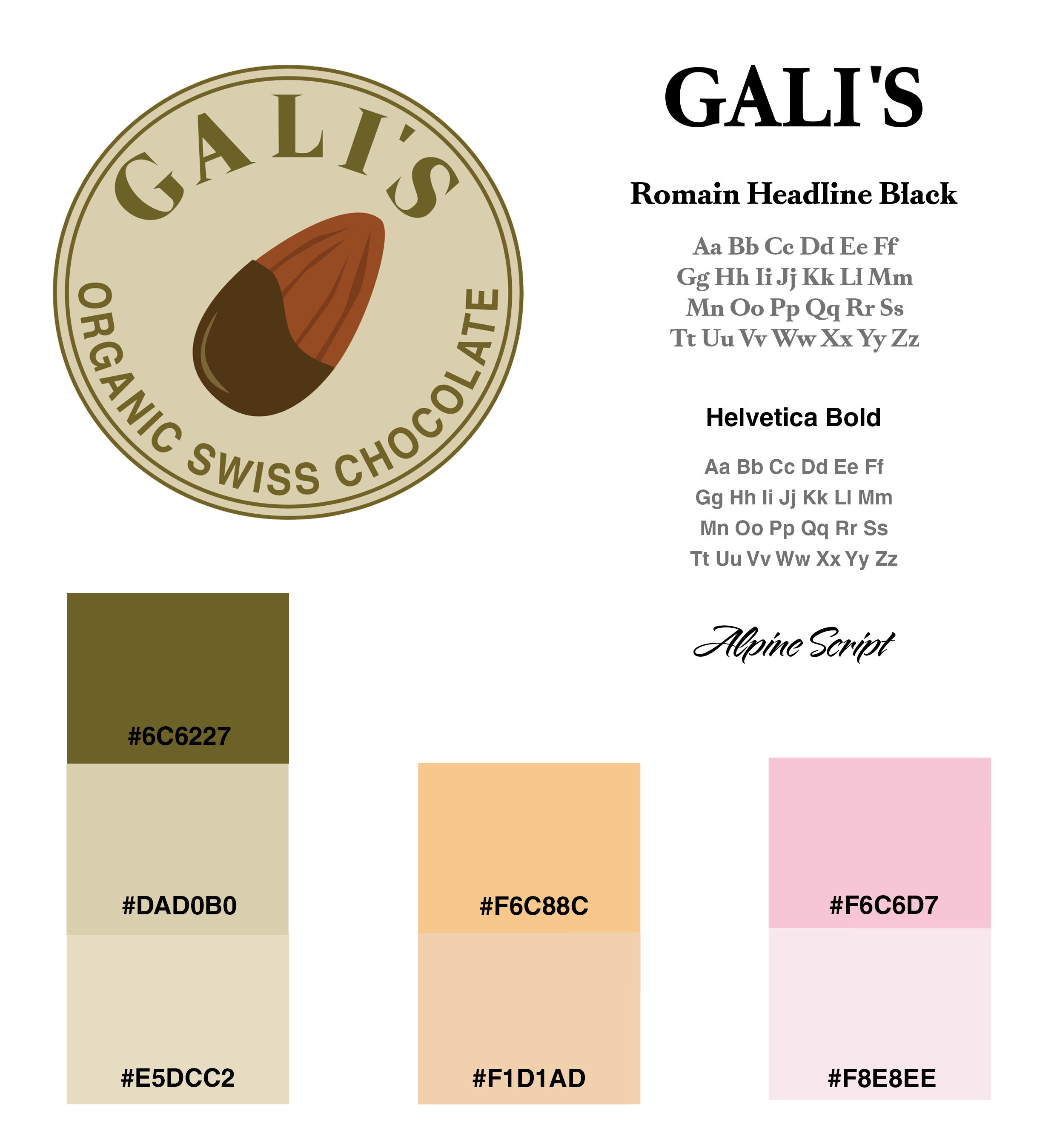
The identity is designed to be simple, confident, and highly recognizable. Typography and layout are intentionally restrained, allowing the material qualities of the product—color, texture, and imagery—to take the lead.
The result is a brand that feels refined without being distant, balancing clarity with warmth.
Packaging System
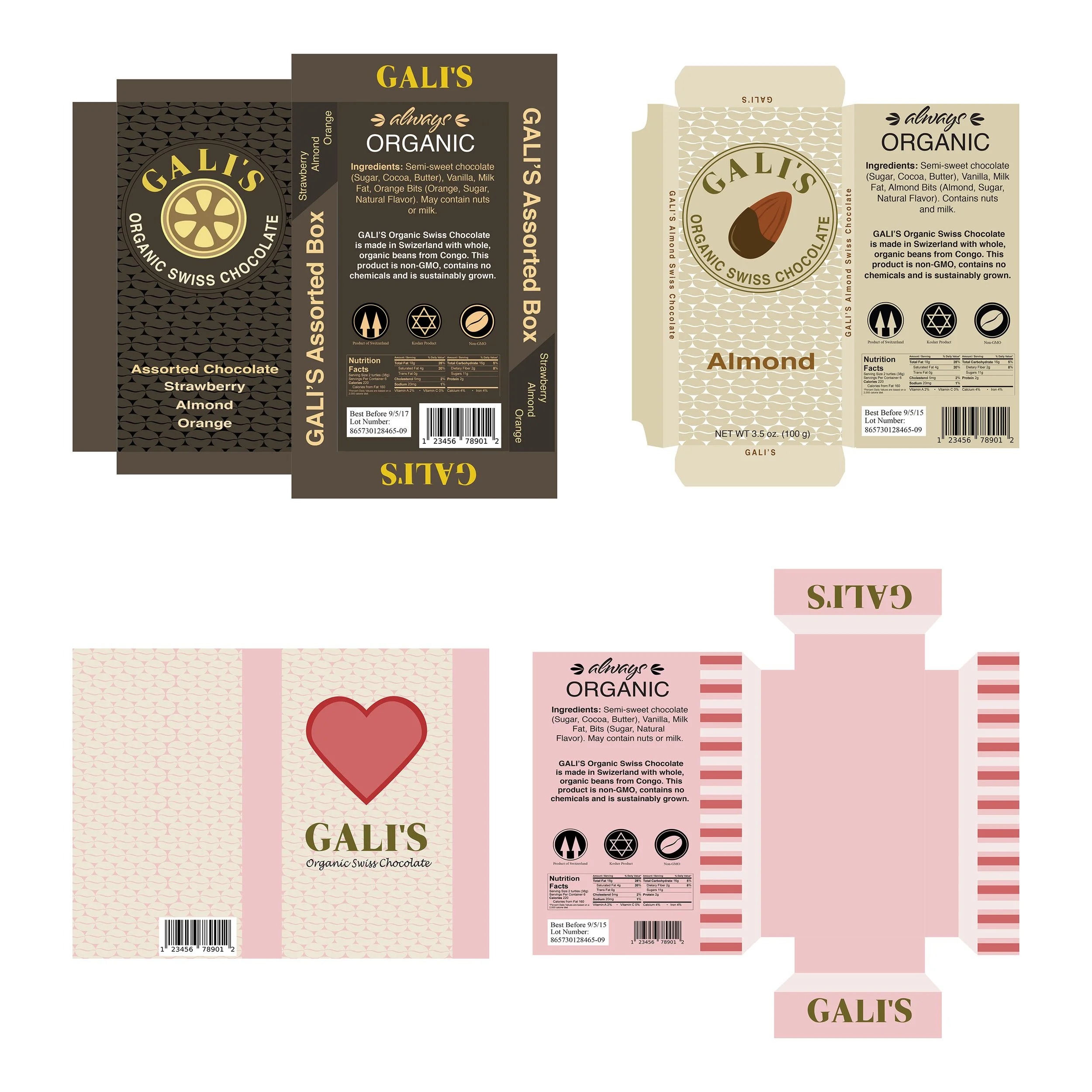
The packaging system was designed for clarity, consistency, and scalability across a full product line. Each element—from hierarchy to spacing—supports quick recognition on shelf while maintaining a cohesive visual presence.
The system allows for variation across flavors while preserving a strong, unified brand identity.
Product Line
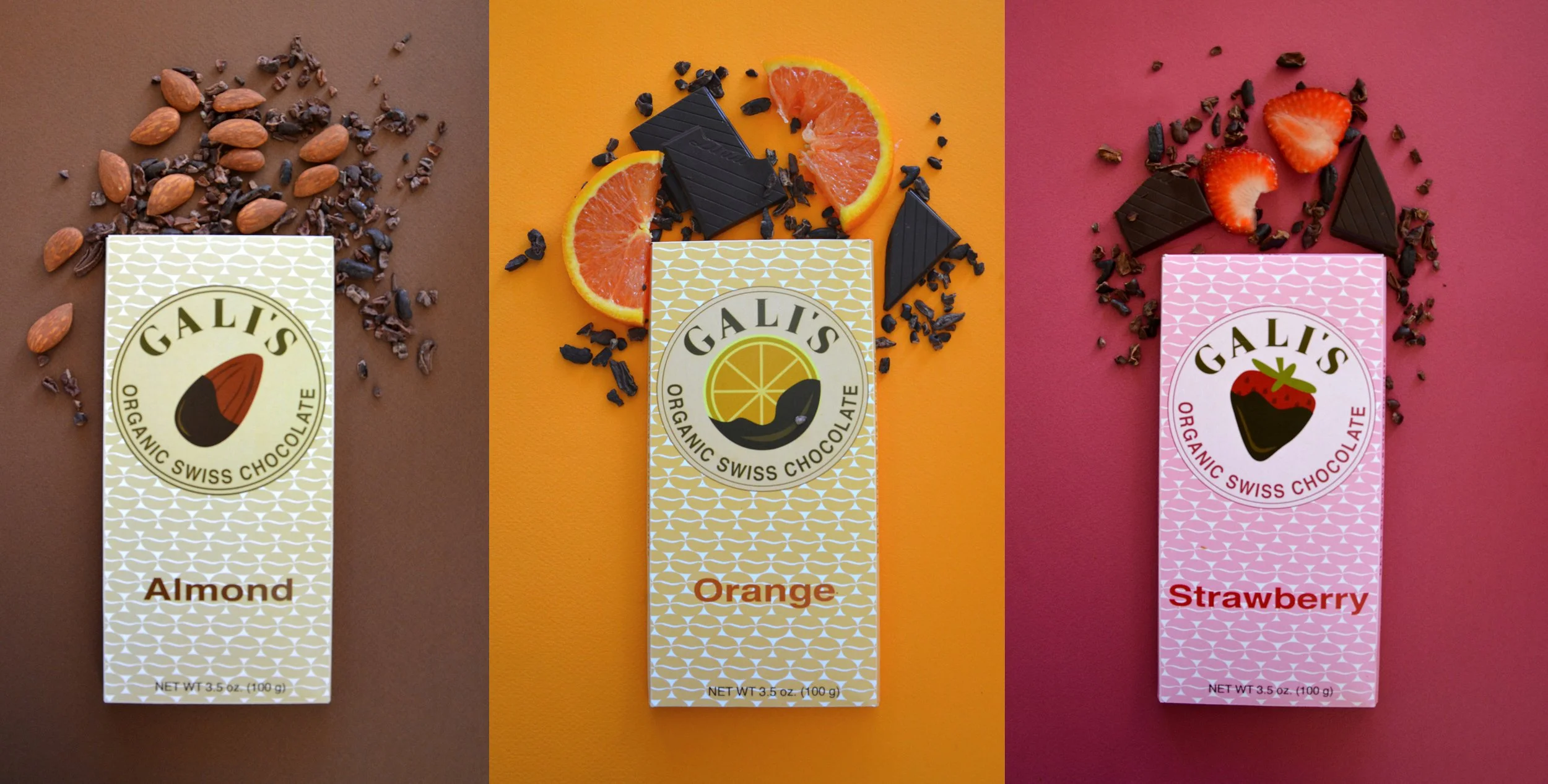
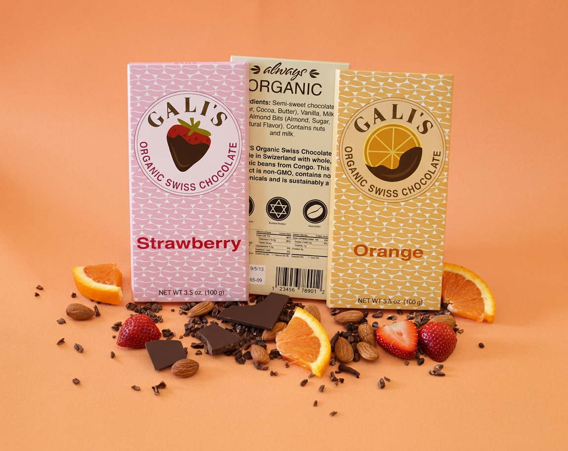
The range includes classic dark chocolate alongside strawberry, orange, and almond variations. Each flavor is expressed through subtle shifts in color and composition, ensuring distinction without breaking the overall system.
The products are positioned as organic, ethically sourced, and free from artificial additives—designed to feel both indulgent and considered.
Specialty Packaging
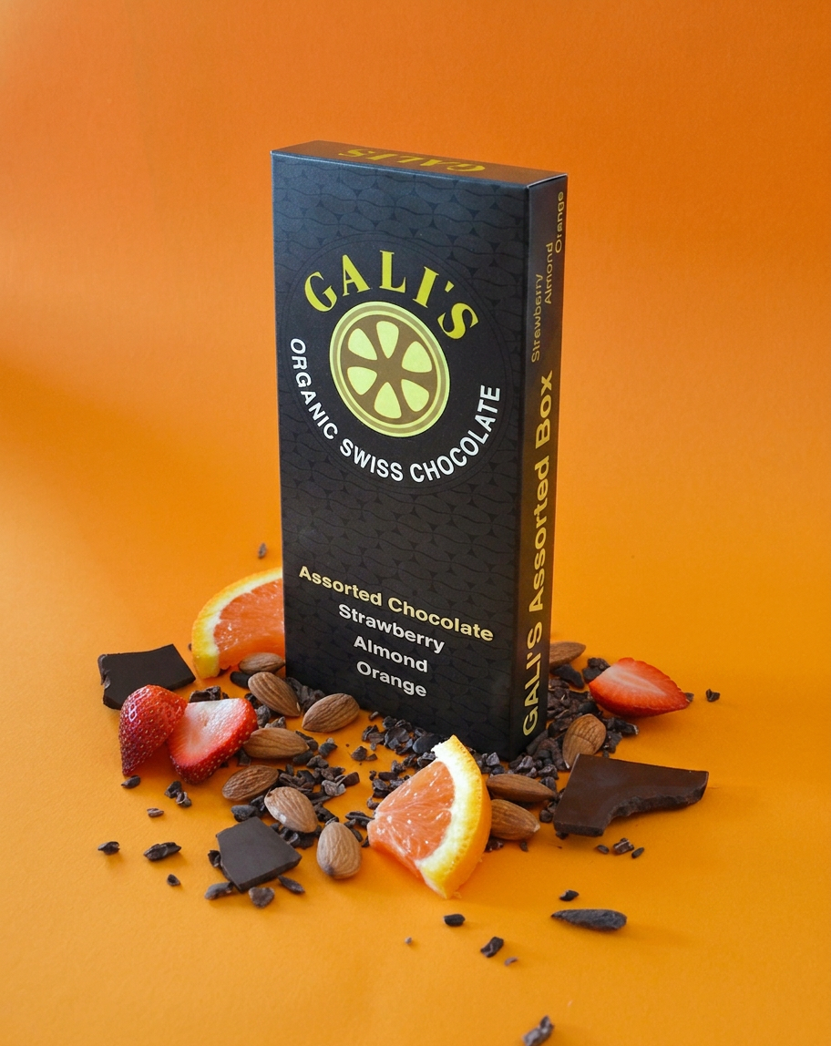
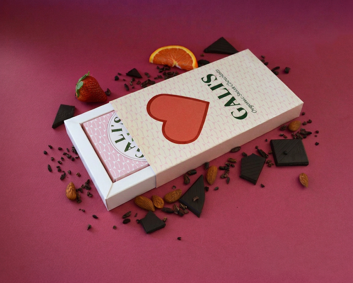
The system extends into specialty packaging, including an assorted collection and a Valentine's Day gift box.
The assortment uses the cocoa pod cross-section as a central visual device, while the Valentine’s box introduces a sliding drawer format—designed to feel like a crafted object rather than disposable packaging.
Materiality & Experience
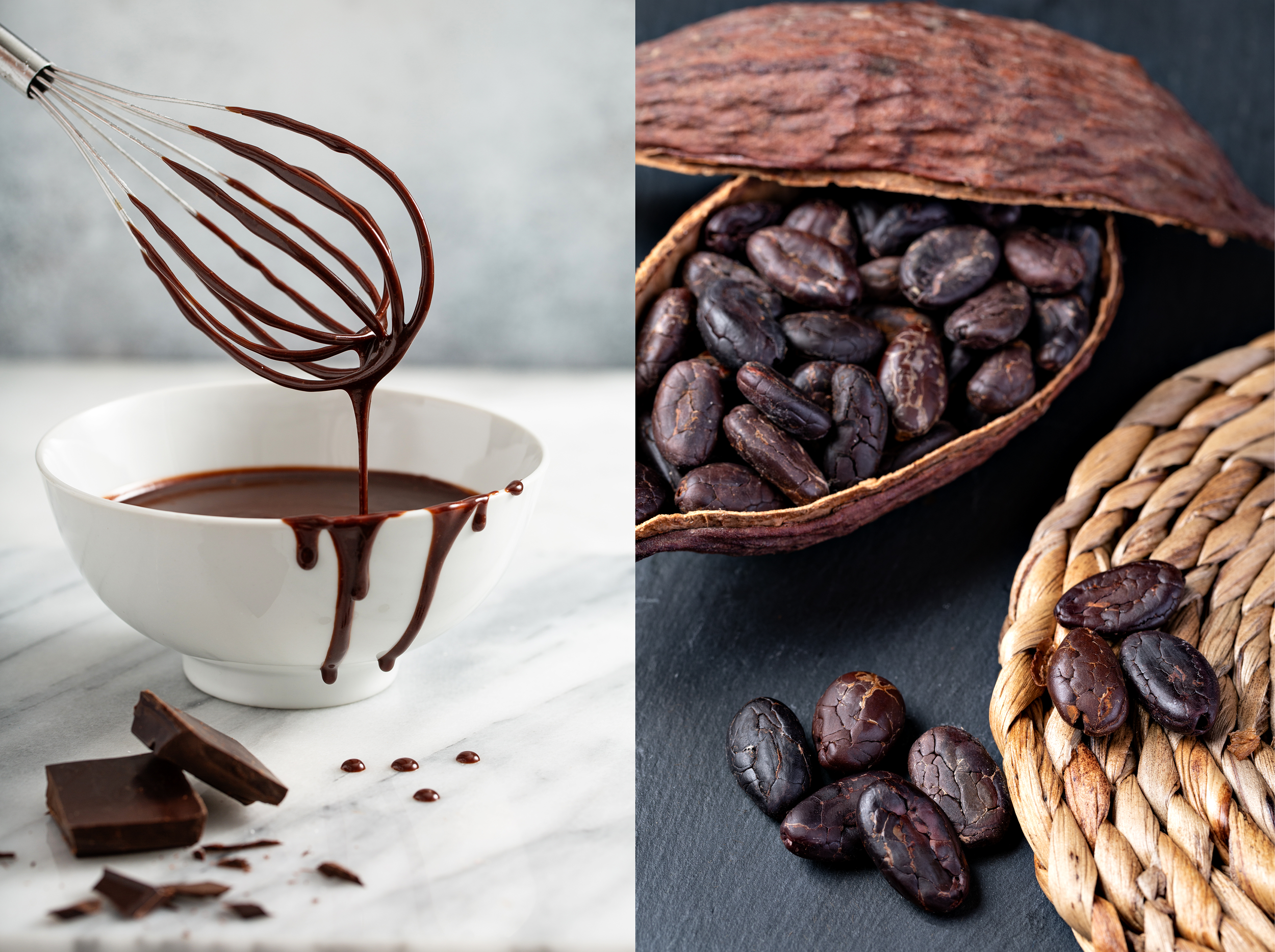
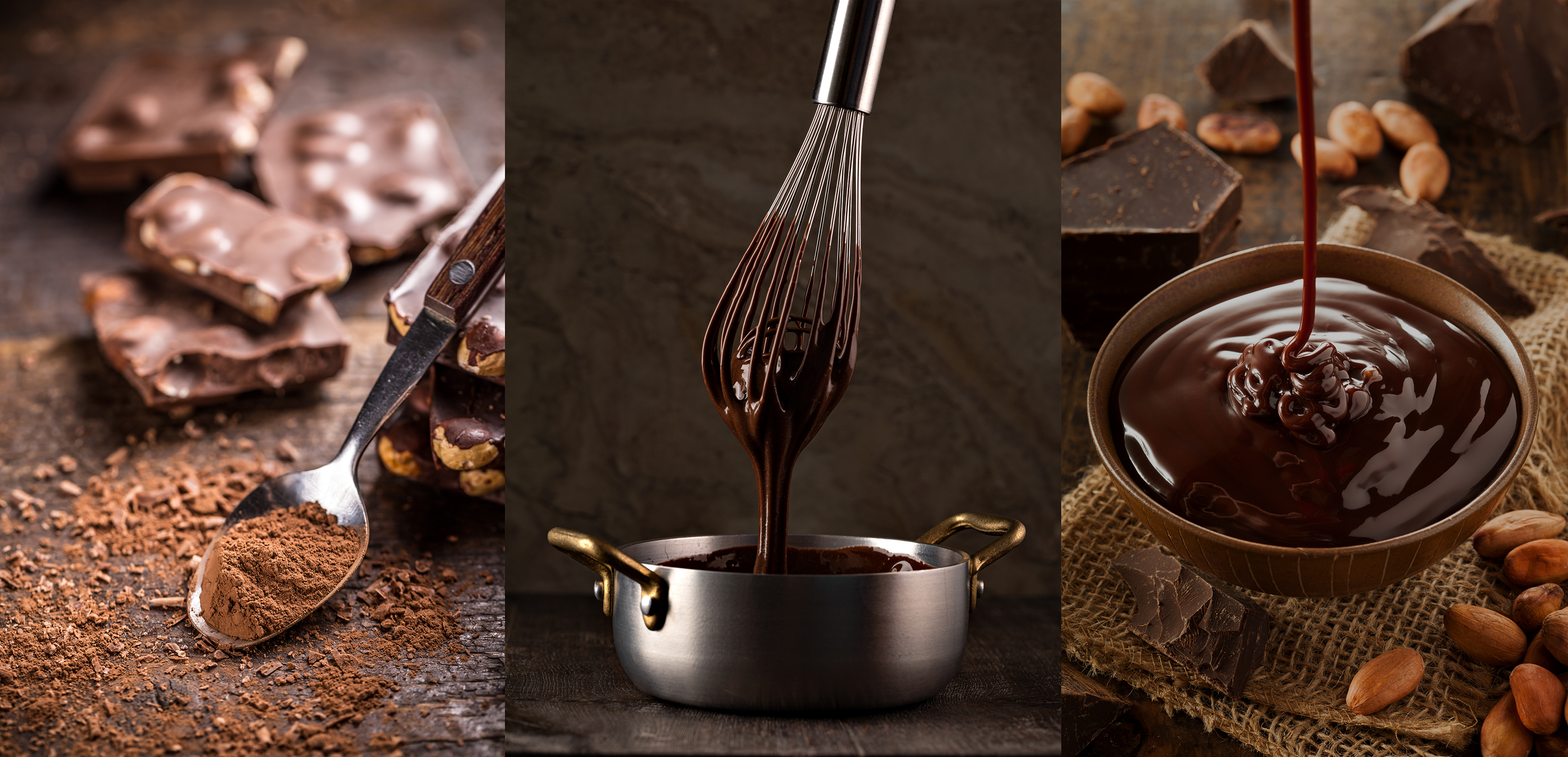
A key focus of the project is materiality and sensory experience. The visual direction draws from food culture—emphasizing texture, process, and the act of making.
Imagery of chocolate preparation and use reinforces the brand’s connection to real ingredients and everyday indulgence, grounding the identity in something tangible and human.